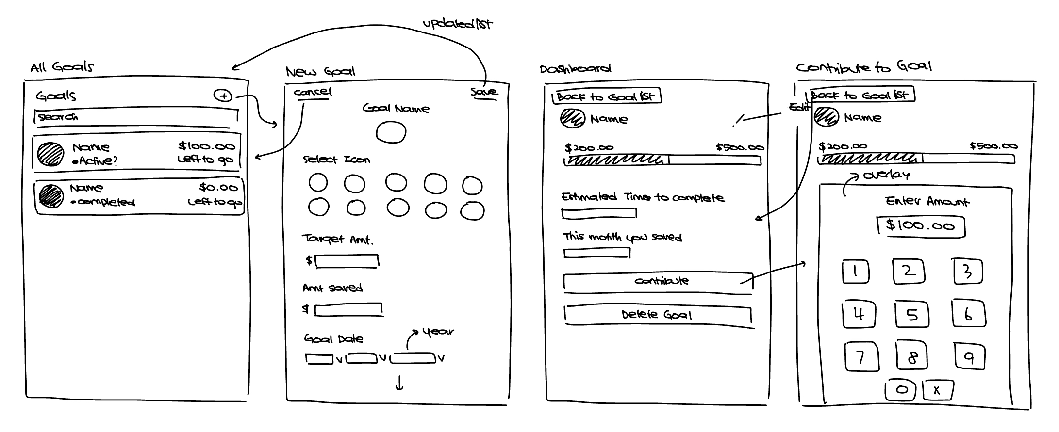
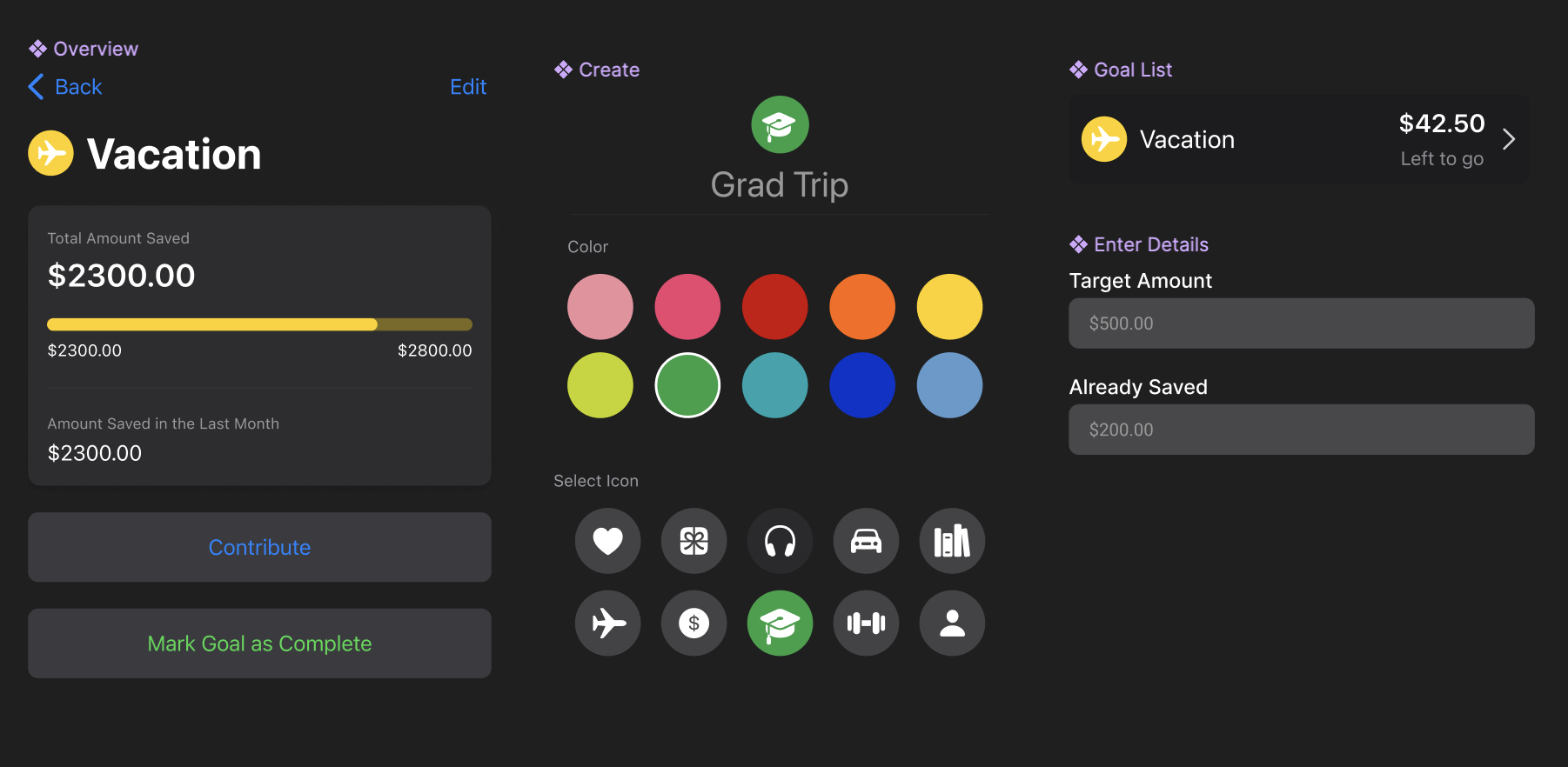
1. Setting a Goal
The flow begins with a simple prompt: What are you saving for?
Users create a goal by:
- Naming it ("Emergency Fund," "Thailand Trip")
- Setting a target amount
- Optionally adding a note
-
Optionally logging any existing savings as a starting balance
We intentionally kept this flow minimal. Conversations during
early design reviews surfaced the need to reduce friction,
especially for users new to structured saving.
We consolidated "Do you have existing savings?" into the new goal
flow (instead of a separate screen) to avoid interrupting
momentum.
2. Manual vs. Linked Deposits
Once a goal is created, users update their progress by logging
deposits—either manually or via linked accounts.
We explored three implementation paths:
-
Manual input (MVP): Most direct and flexible;
users add deposits anytime they save.
-
Linked savings account via Plaid: Automatically
attributes transfers toward goals based on rules. More seamless,
but higher technical complexity and risk of misattribution.
-
Percentage-based automation: E.g., "10% of any
deposit goes to savings goals." Simple for users but blurs the
boundary between spending and saving accounts.
We prioritized manual entry for the initial release. It gave users
control, required minimal backend complexity, and avoided the
confusion of automated withdrawals. Smart allocation rules via
Plaid were logged as a future enhancement.
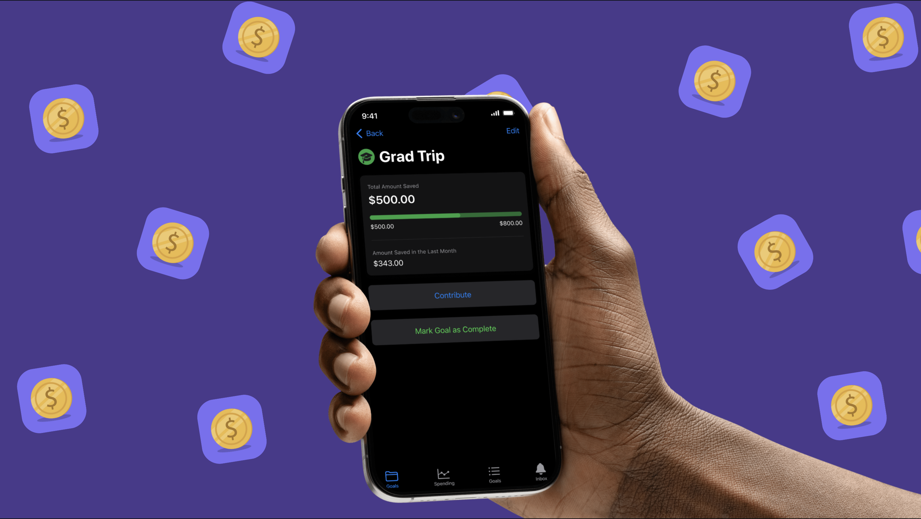
3. Visual Feedback
Savings progress is visualized through a clean progress bar or
percentage wheel. This made progress tangible and satisfying, even
if the numbers were small.
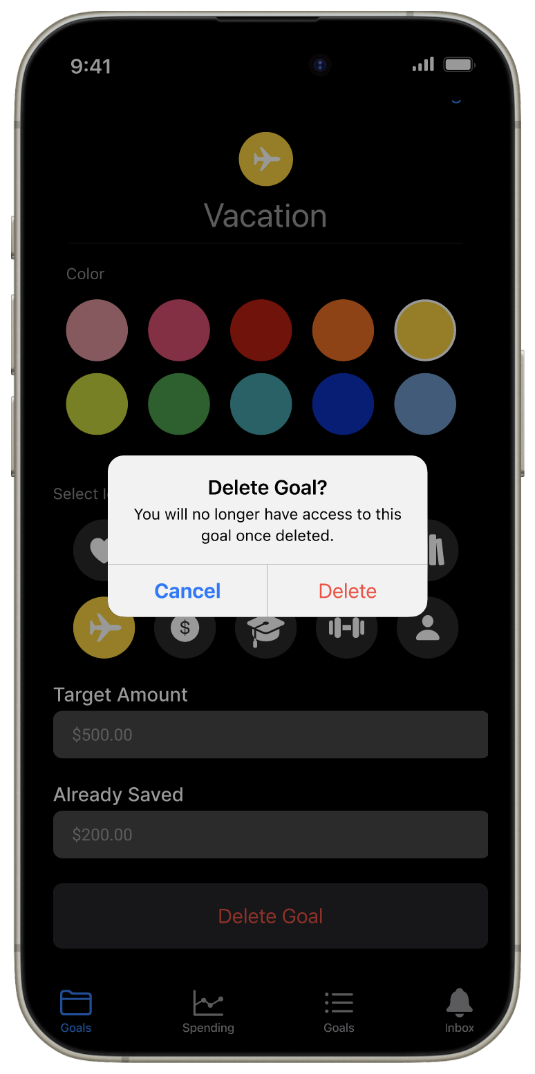
Each goal screen displays:
- Goal name + editable note
- Target amount + current progress
- Estimated completion time (based on deposit history)
- Deposit log (manual + linked, with dates and amounts)
-
Optional motivational insights (e.g. "You've saved $200 this
month!")
Progress visualization was designed to feel fluid, not mechanical.
Completion estimates offer orientation without pressure.
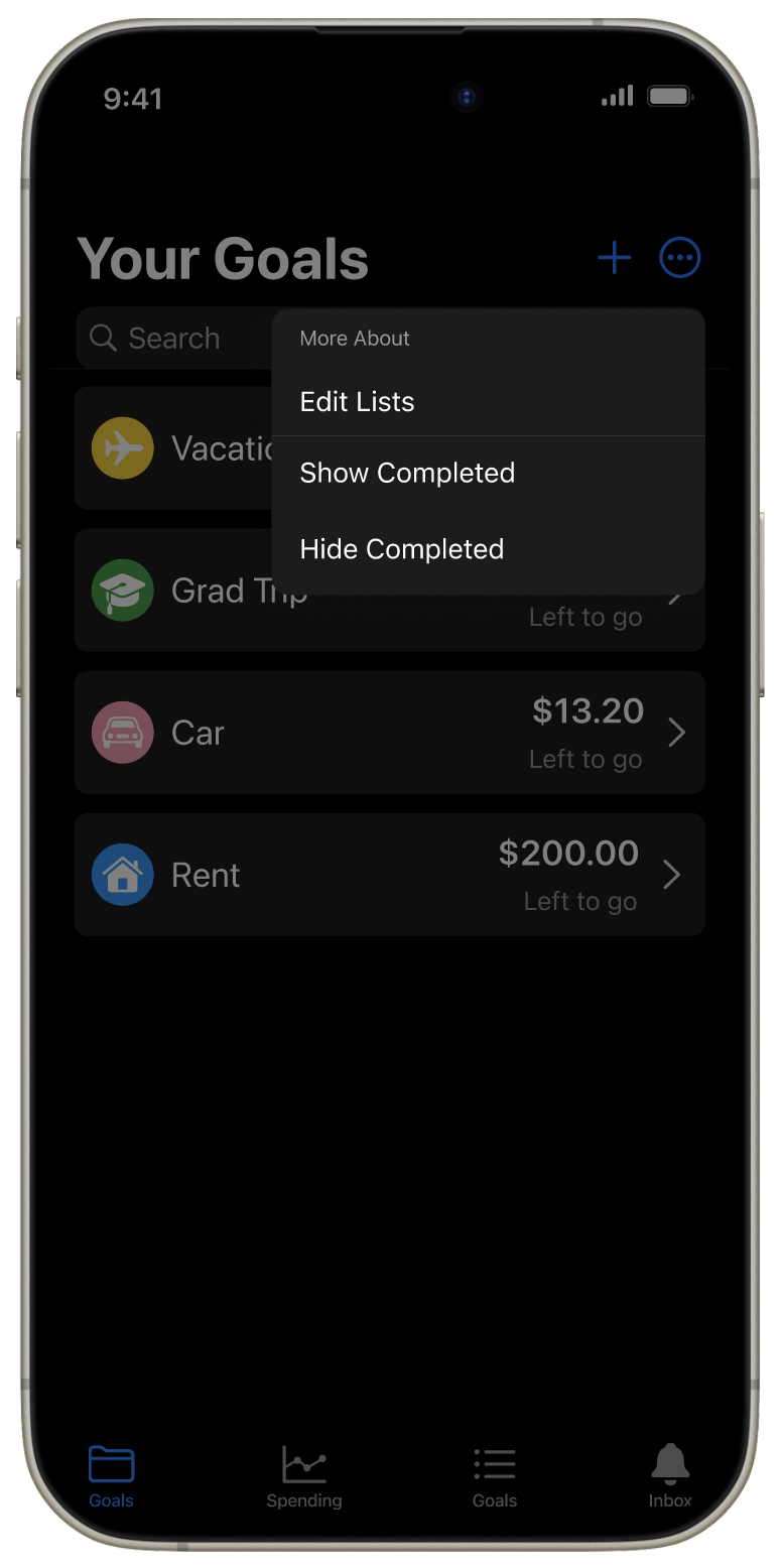
4. Dashboard + Goal Management
Goals live in a consolidated dashboard view, where users can:
- See all active goals at a glance
-
Toggle to show/hide completed goals (inspired by the iOS
Reminders app)
- Tap into any goal for deeper insights
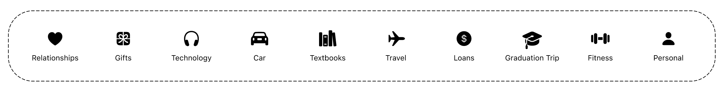
We originally considered using category icons for each goal (e.g.
plane for travel, piggy bank for emergency), but this created
confusion with spending categories. Instead, we adopted a
universal icon with color customization, giving users a small
moment of ownership.
Color-coding let users bring personality to their goals without
cluttering the UI.
5. Reinforcement + Motivation
We wanted users to feel recognized—not in a gamified, high-stakes
way, but in small, timely moments.
Ideas we explored:
- Milestone badges for reaching 25%, 50%, 100%
- Encouraging notifications tied to deposit behavior
-
Streaks for regular saving (ultimately scrapped—see below)
We intentionally removed streaks after user research showed that
inconsistent savers felt discouraged by them. Instead, we leaned
into quiet encouragement, like, "You added to your savings again
this week—nice work."
We also decided against implementing recurring savings schedules.
Users who forgot they turned on automation often felt confused or
frustrated when money moved unexpectedly.
Design Decisions
-
Location in app: After discussion, we housed
Savings Goals under the Budgets tab instead of introducing a new
one—simplifying navigation and maintaining cohesion with
financial planning.
-
Completion flow: We debated adding a "Mark Goal
Complete" CTA, but opted for automatic completion when the goal
target is met. It reduces friction and avoids unnecessary
decision-making.
-
Filtering: Completed goals are hidden by
default, but accessible via a toggle. This gives users a sense
of closure without visual noise.